Case Study
Providence Hospital App
I created an AI powered, all-in-one, healthcare app for Providence Hospital to make the patient experience easier and more accessible. Providence Hospital is a large, nonprofit faith based health system operating across the greater western United States. The Providence app enables users to seamlessly access and manage their health records, schedule same-day appointments, and conduct virtual visits, all within a unified platform. By putting key capabilities at their fingertips, the app empowers individuals to take an active role in their care journey through a streamlined, user-centric approach to wellness. This was a 9 month long project creating a new mobile app using the old app as a reference, resulting in greater accessibility to healthcare among the disabled, significantly reduced support requests and administrative calls, and a simplified MyChart experience.
Product: Providence MyChart
My Role: Product Designer
Team: Angela Kaiser (Product Manager)
Tools: Figma, Miro, OpenAi (API), Google Gemini, FullStory,
Adobe CC
Context
In many healthcare systems, navigating care information and connecting with providers often feels fragmented and overwhelming. Patients increasingly expect, and rightfully deserve, seamless, intuitive solutions that simplify access and foster meaningful engagement with their care teams.
Problem
Users found it difficult to navigate the Providence MyChart website to schedule their appointments, access their health records, communicate with their doctors, and access their billing statements. The site was not accessible, did not scale to mobile, and had some serious issues with bugs and functionality.
Solution
I created a healthcare app that allows users to access their MyChart, communicate with their healthcare providers, access their health records, schedule appointments, view and pay their bills, and discuss their healthcare concerns with our AI chat bot, Grace.
Impact
The Providence App not only maintains a solid 4.8 out of 5 star rating on the App Store and Google Play, it is also the 2024 gold winner in the mobile app category from both the Aster Awards and Healthcare Advertising Awards.


Step 1 - Exploration
I started out by gathering our technical and business requirements for the project by connecting with key stakeholders on the client's side, product manager, and the engineering team.
I led a live user journey workshop where we defined the tasks, goals, user emotional journey, user pain points, and the feature opportunities as a group.

I then created a flow chart to visualize the proposed information architecture for the app.

Key Takeaways
After connecting with the PM, stakeholders, and the Development team and finalizing our exploration phase, we came up with the following requirements for this app.
Must be able to be built on React Native framework with some custom design library components.
Needs to be fully accessible for those with medical and mental disabilities.
App needs to make it very easy to schedule both virtual and in-person appointments securely.
The app needs to incorporate all the functionalities of MyChart and connect to MyChart, but with a better UX.
Step 2 - User Research
I used analytics we had from the previous app and analyzed the user conflicts from FullStory. I had some users of the old app volunteer to participate in user interviews, which I conducted with a set of questions I put together using my insights from FullStory. I wanted to find out which parts of the old app were helpful, what parts were confusing, and what parts weren't needed. During this process, I gathered the following insights.

Group MS Teams call with our users.
"The old app just links to the MyChart website, but MyChart is not mobile friendly so it is a useless function."
Providence app user in 1:1 Interview
Not only would the old app simply link to MyChart and not offer any of the capabilities in the app itself, it would also make users log in again, which was frustrating for them and caused a lot of abandonment.
"It is difficult to schedule appointments on the app. It is a lot easier to call in to the clinic."
Providence app user in
group Interview
We wanted to lighten the load of the scheduling staff who were already overwhelmed with calls, often leading to long wait times. Our app was frustrating enough to schedule appointments that people often opted to wait on hold instead.
"There is no information about available providers in the [old] app. It is hard to know who I am supposed to be scheduling."
Providence app user in 1:1 Interview
The old app also had a lot of issues with users accidentally scheduling the wrong doctors because they couldn't remember individual doctor's names and their specialties. This resulted in a lot of wasted time in clinics and clogging up schedules.
With these insights from our users, we came up with a plan to address these pain points. We created the following design goals.
The app needs to connect to MyChart natively without requiring another log in or taking the user out of the app.
Users need to be able to schedule both in-person and virtual appointments very easily with little confusion.
The app needs an AI chatbot to answer simple questions and give suggestions.
The AI chatbot needs to answer common medical questions and suggest care providers.
Step 3 - Personas
User With Chronic Medical Needs
Has lots of appointments, billing statements, and medical records to keep organized.
Motivation
Wants the easiest way to keep their medical needs organized and easily accessed.
Behavior
Uses the Providence app frequently to schedule appointments, pay bills, access medical records, and contact their care team.
Pain Points
Keeping their appointments organized, accessing test results can be confusing, and it can be hard to find necessary information and details about scheduling.
Design Consideration
Needs a very easy way to schedule appointments, view provider information, and pay bills.
Healthy Adult User
A healthy adult that only needs occassional health care visits and has simple healthcare needs.
Motivation
Wants a quick way to schedule appointments and access their health records on short notice.
Behavior
Likely goes to infrequent check-ups and doesn't access their healthcare information unless it is needed or they are injured.
Pain Points
It is hard to remember which providers the user has visited before. Not sure if their illness is "severe" enough to warrant a visit to the doctor.
Design Consideration
AI chatbot should include symptom checker and advise the user on providers based on their history.
Underprivileged Adult User
Goes to Providence due to lack of insurance or income. Has an average amount of medical concerns.
Motivation
Wants access to the Providence Health system discreetly and wants questions answered without judgement.
Behavior
May not be familiar with the Providence Health financial resources, likely looking for payment and billing information and what providers take financial aid.
Pain Points
Financial aid information is hard to find on the current app and there is no way to ask additional questions.
Design Consideration
AI chatbot should include information on billing, financial aid, and direct the user to providers that take financial assistance.
Parent of Child Patient
Not the patient, but the caretaker of a patient who is unable to use the app themselves.
Motivation
Wants easy access to their child's medical information and a simple way to manage appointments.
Behavior
Goes to many well child visits and appointments for frequent childhood illnesses and injuries.
Pain Points
Needs to manage medications, schedule urgent appointments, and get provider suggestions.
Design Consideration
Needs to be able to find a provider fast, sometimes same day. May need access to virtual appointments with whoever is available the soonest.
Step 4 - Design System and Process
Design System Development
We collaborated closely with our engineering team to align on a scalable, flexible design system that would support both current and future product needs. From the outset, our shared goal was to begin integrating core components into Storybook as early as possible to streamline handoff and reduce overall development time. On the design side, we leveraged Figma’s library features to build a centralized, reusable system of components that could be easily maintained and applied across multiple product surfaces. Accessibility was a key priority throughout the process. We ensured that all components adhered to WCAG guidelines to promote inclusive, user-friendly experiences from the start.

First Drafts
I presented the first drafts to our product manager, developers, and our client stakeholders for feedback. I made notes of sections that needed further user testing, noted sections that needed better visual design aspects, and made note of client design requests.


Step 5 - User Testing
I developed a fully functional, high-fidelity prototype in Figma to simulate the end-to-end product experience. To validate design decisions, I conducted qualitative user testing focused on gauging emotional response, comparing positive vs. negative reactions across distinct audience segments, while guiding participants through targeted task scenarios to evaluate usability and clarity.
In addition, I led a series of blind studies and longitudinal diary tests, where users documented their experiences over time. These diaries captured key insights around ease of use, content relevance, and initial impressions, providing a rich foundation for iterative refinement and stakeholder alignment.

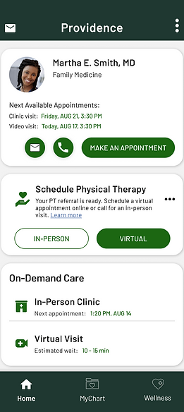
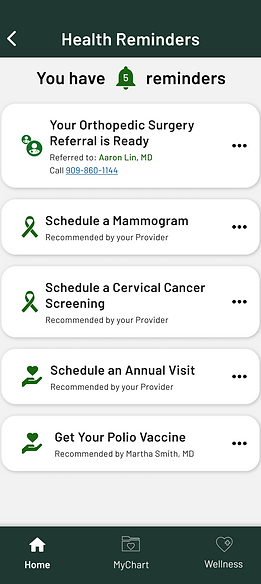
I reviewed the results of the user testing and found that the above screens needed refining. The provider information was clearer, but the way the information was laid out on the dashboard wasn't obvious to our users and needed to be broken up into different sections.
The information architecture needed to be revisited and refined to be more intuitive.
It needs to be easier to determine what is a "Health Reminder" vs what is a dashboard item.
Through stakeholder, development, and product management reviews and refinements as well as a few iterations and more user testing, we came to a solution that was much more user friendly and easy to use.
Step 6 - Edge Cases
After launching our V1 working prototype for testing, I discovered some edge cases within our design that needed to be addressed.
-
Sudden cancellation of live virtual appointments
A few users would start a virtual appointment then immediately exit out of the app, explaining that they didn't expect the virtual appointment to start right as they submitted their information. We decided to include a confirmation page to make the user more ready for the appointment to start.
-
Input issues with AI chatbot
Some users struggled to input requests to the AI chatbot in a way that would produce the results they were expecting. I iterated on the chat interface to include suggested inputs to get the chatbot to find the information the user was looking for.
-
Timeout of map loading
Occassionally, the map component would timeout and cause the app to crash. I decided to include an error page that would catch the timeout failure that had a reload button for the map to allow the user to refresh the component without the app failing.
Step 7 - Final Design
Following usability testing, I implemented targeted UI enhancements based on direct user and stakeholder feedback, refining interaction patterns, layout hierarchy, and visual clarity to improve overall usability. I then prepared the final design assets for engineering handoff by thoroughly annotating each screen, documenting expected behaviors and edge cases, and ensuring all components were linked to the shared design system for consistency and efficient development. Prototypes were kept up to date in Figma and Jira, with clear versioning and embedded developer comments to support smooth collaboration and reduce ambiguity during implementation.


Learnings
This project significantly deepened my understanding of optimizing information architecture, particularly within the context of designing for vulnerable or underserved populations. Our user base included individuals who were elderly, disabled, underprivileged, and often navigating high-stress healthcare situations. Through extensive research and usability testing, it became clear that even minor friction in navigation or cognitive load could create major barriers to access.
As a result, I focused on simplifying user flows to be as intuitive and linear as possible, minimizing decision fatigue and reducing the need for interpretation. I prioritized clear labeling, progressive disclosure, and strong visual hierarchy to help users quickly identify where they were, what they could do, and how to get help if needed. I also implemented accessible interaction patterns that adhered to WCAG standards, including larger touch targets, simplified language, and voice-over compatibility.
One key UX insight was the importance of anticipatory design, proactively surfacing relevant next steps and removing unnecessary complexity before users needed to ask. Another was the critical role of redundant cues (e.g., icons + text) to support those with cognitive or language processing challenges. Overall, the project reinforced the principle that accessibility and clarity are not just compliance goals, they’re core to designing inclusive, compassionate experiences.